Xbox 360 Video on Demand App
Project Scope and Interaction Design
Feature Selection, Wireframing, Interaction Design, UX Consulting
A well known spanish startup approached the company I was working at that time with the inquietude of porting their service onto various platforms, being Xbox one of our specialties we proceeded to understand their business, the solution and imagined a way to translate their online web service onto an Xbox 360 Application using Metro Style.
Project Kick off
Work began by analysing all the research data that had been available to us, it helped me understand their market, target audiences, service offering, business goals, etc.
I conducted an internal workshop at our company where we got to define the essential service and interaction elements that were going to make it to the Xbox version, not all the service could be adapted and developed for the first iteration.
At first we asked ourselves different versions of this: "Can [Client name] afford not to do [feature name] and still stay in business and be competitive?"
After reaching a list of features, we proceeded to estimate the weigh of each feature and how hard it would be to develop it, also how important each feature was for the business and how attractive it would be for its users
Our initial insights are partially documented in this pages:

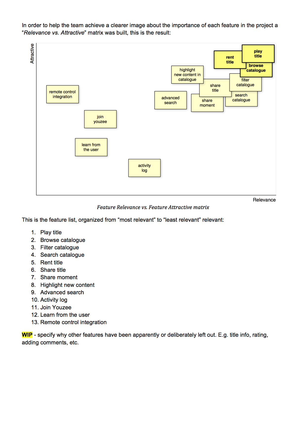
Features list
This list became the first ones to be implemented in the XboX 360 version of their service, it managed to distil the very essentials of their offering and their business model:
Must Have Features
- Video
- Title Rent (Pay, Add payment option)
- Title Play (Stream, Share, Language, Quality)
- Catalogue
- New titles
- Catalogue Browse
- Search and Filter
- User Session
- New User
- Existing User (firs time / returning)
Additional features
- Advanced Search
- User Activity Log
- Smart Catalogue (from User's preferences and interests)
Wireframes
Once the project scope was approved by the client, the technical team began working on early prototypes of the streaming functionalities, meanwhile I began to create the wireframes for all of the features to be developed later.
This is a small sample of the larger set of interactions I designed for the application:
App Main Menu Screen
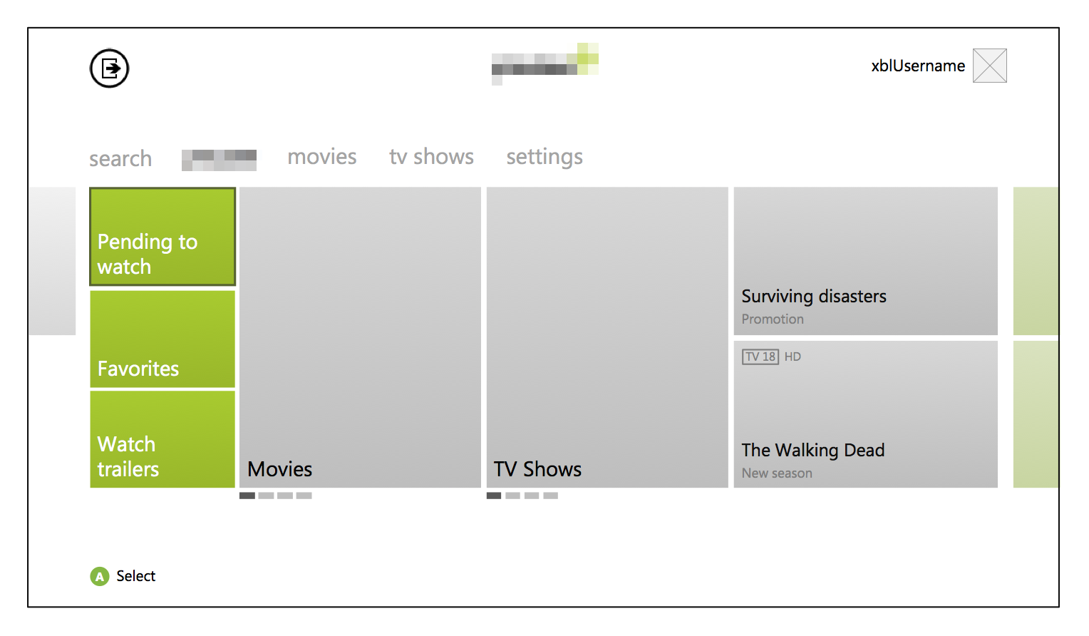
Shows the main navigation, highlighted movies / series, the basic user options, the console instructions for navigating like the A button and the exit button on the top left of the screen.
Movies Screen
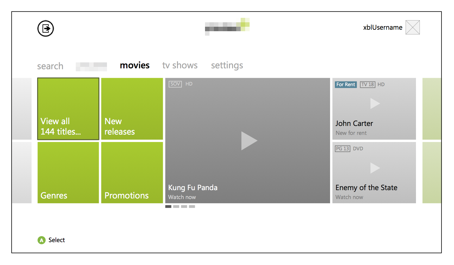
Presents the user with the options that will allow browsing the complete catalogue, highligted releases or a pre-filtered browsing all movies by new releases, genres, etc.
Title browsing
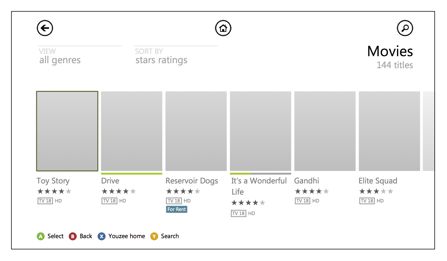
Shows a list of all movie titles, organised by user ratings, allows the option to filter it by genre or see more details about the title.
Movie detail screen
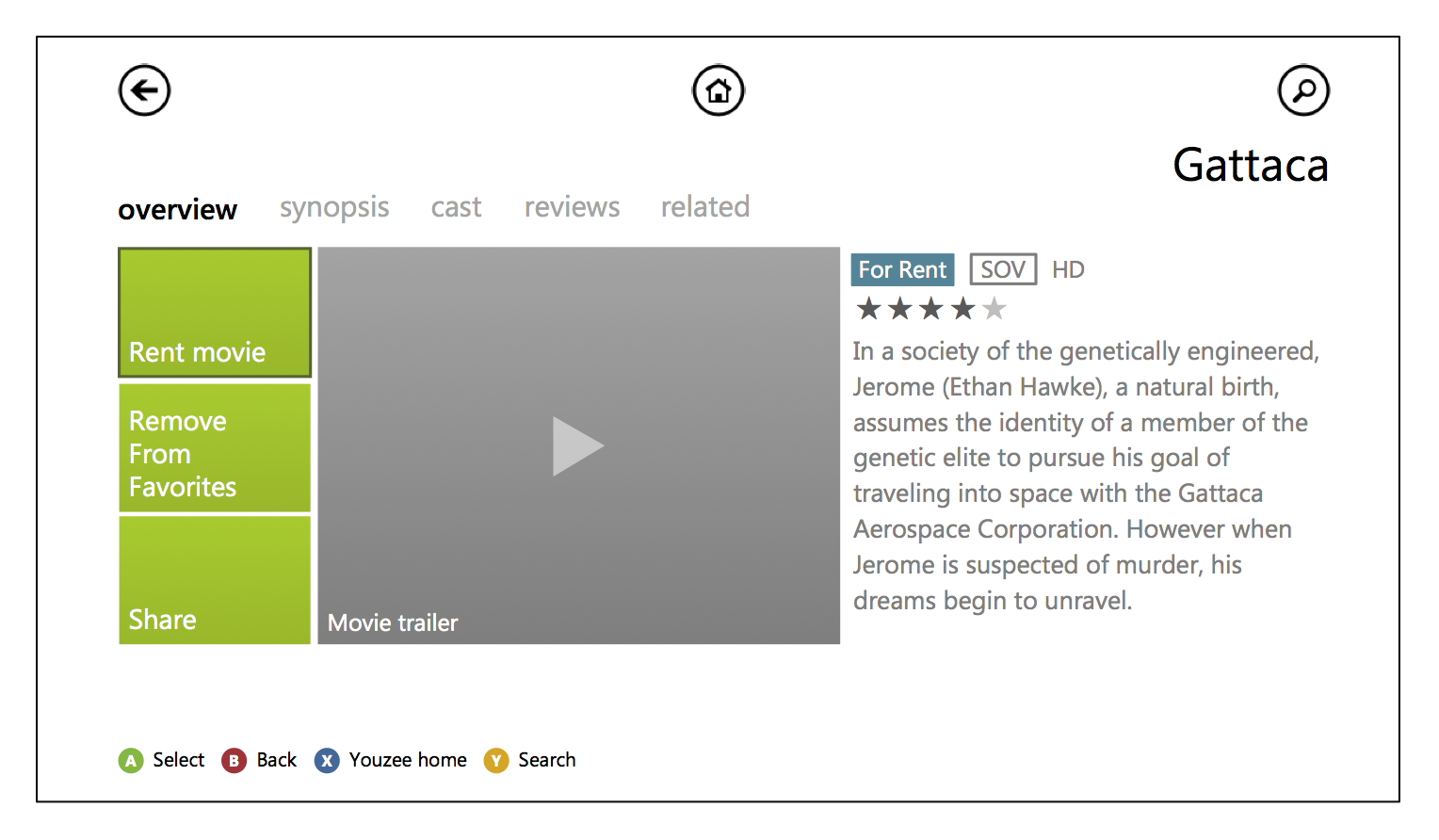
Shows the movie information, access to the synopsis, cast list, user reviews and related movies. It allows the user to watch the movie trailer, rent or sharing options.
Renting
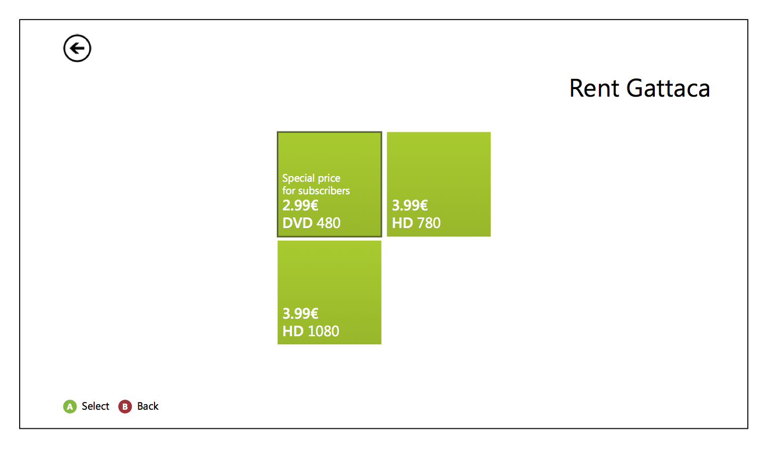
Displays the rent options for the movie.
Wireframes
Lorem ipsum dolor sit amet, consectetur adipiscing elit. Duis ante ligula, blandit ullamcorper dictum a, cursus in felis. Vestibulum luctus sodales sem ut fermentum.
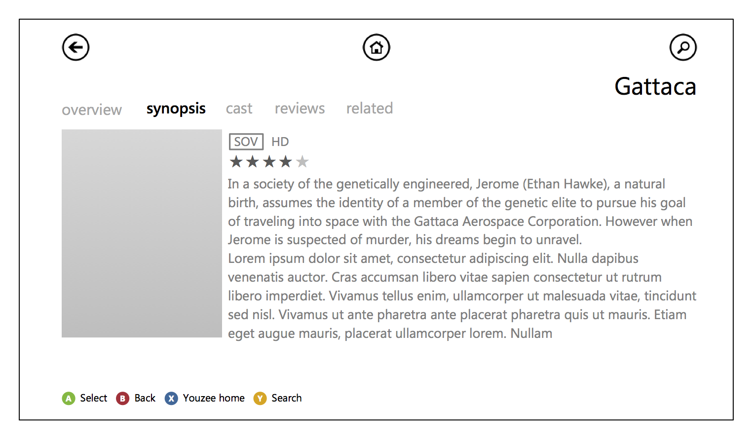
Movie synopsis
Displays the movie poster and its desription.
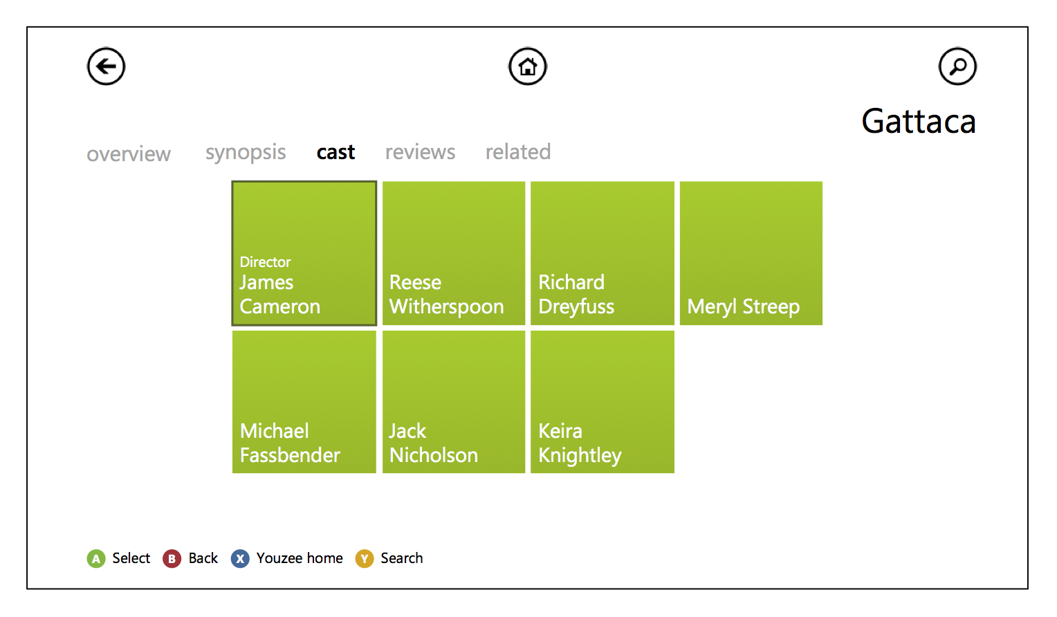
Movie cast
Shows a list of options that correspond to the movie director and acting cast, selecting one of the options makes a search in the whole catalog for all the titles (movies or series) with that cast or director.
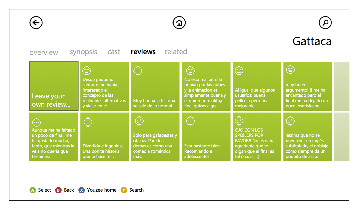
Leave a review option
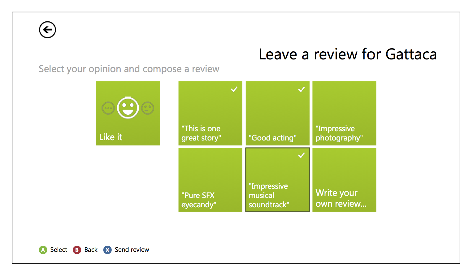
Lets the user emply the service review system, it worked by saying if the user liked or disliked the movie, and additionally adhering to one or more of the existing reviews written by other users. If there isn't a review that fits their opinion there was the option to allow writing their own short review.
Main Menu, TV Shows screen
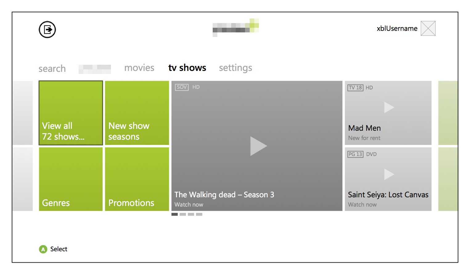
Very similar to the movies titles screen, but this has been adapted for series.